
Longman’s
Taste What’s Missing.
Oakland, CA
SERVICES
Naming
Brand DNA
Verbal Identity Development
Visual Identity Development
Label & Packaging Design
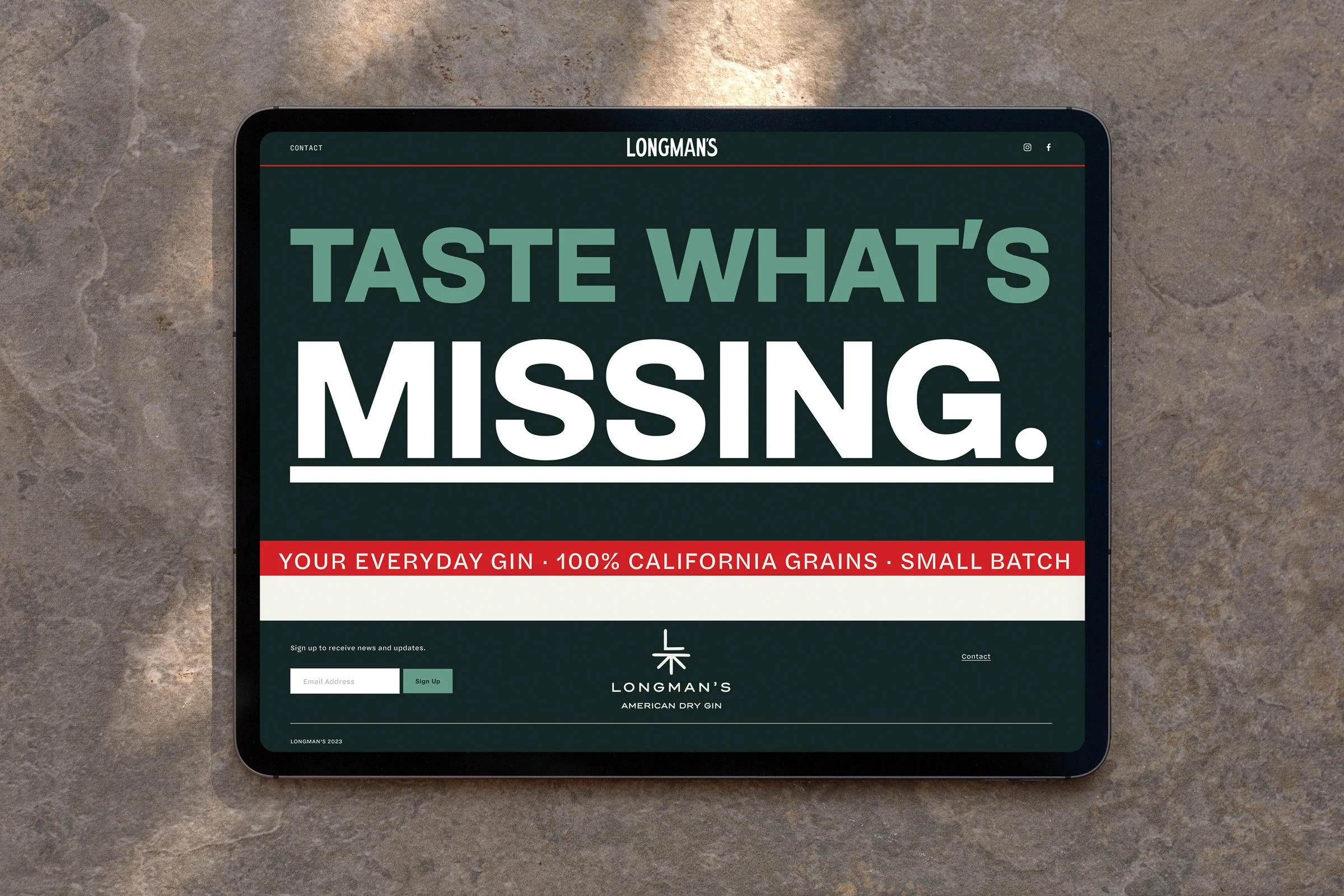
Website Design & Development
Merchandise Design
Art Direction
Collateral Design
-
“I want it to feel like it's the kind of gin that’s been around forever and will be around forever."
How does a brand embed itself into a slice of American life? This was the question the Carbonate team set out to explore when developing the brand identity for a new Oakland-based gin. Two longtime friends, and Bay Area natives, shared a vision to produce a new kind of gin that embraced simplicity, maintained high standards and celebrated the industrious grit that built their hometown. The founders tapped Carbonate to help bring their new small batch, American-style dry gin to life.

Our team was tasked with developing a name that was both timeless and paid homage to the Oakland spirit. Longman's, which comes from the word longshoreman (or dock worker), is a nod to the industrious spirit of the pioneers who built the Bay Area — and to all those who keep the wheels turning, the engines humming, and the fires burning today.


Using only seven botanicals, and building upon one of the founders' expertise as a notable Oakland brewer, Longman's is an easy drinking, “everyday” gin. It was crucial the brand identity captured and conveyed that the products simplicity made no sacrifice on quality.


The bottles label design was heavily rooted in the tactile qualities of the material and speciality printing processes used which enhance the simplicity of the design, and convey an elevated quality and attention to detail. Our team continues to support the Longman's brand development through various collateral design, website and merchandise design and ongoing packaging design.
The primary logomark was inspired by hand-painted lettering used in turn-of-the-century industrial signage. A brand icon combines a nautical navigation symbol for 'benchmark' with a simplified 'L' letterform as a nod to setting standards, while a custom hand-drawn illustration of a longshoreman with a Koi fish subtly ties back to one of the founders’ familial connection to Chinese culture and the role that the docks and cargo have played in the shaping the Bay Area.
A minimalist color palette references oceanic hues, vintage mercantiles, Americana, and Asian influences in nostalgic and slightly muted tones which work harmoniously with the other branding elements to create a striking yet distinctive visual language that stands out.


