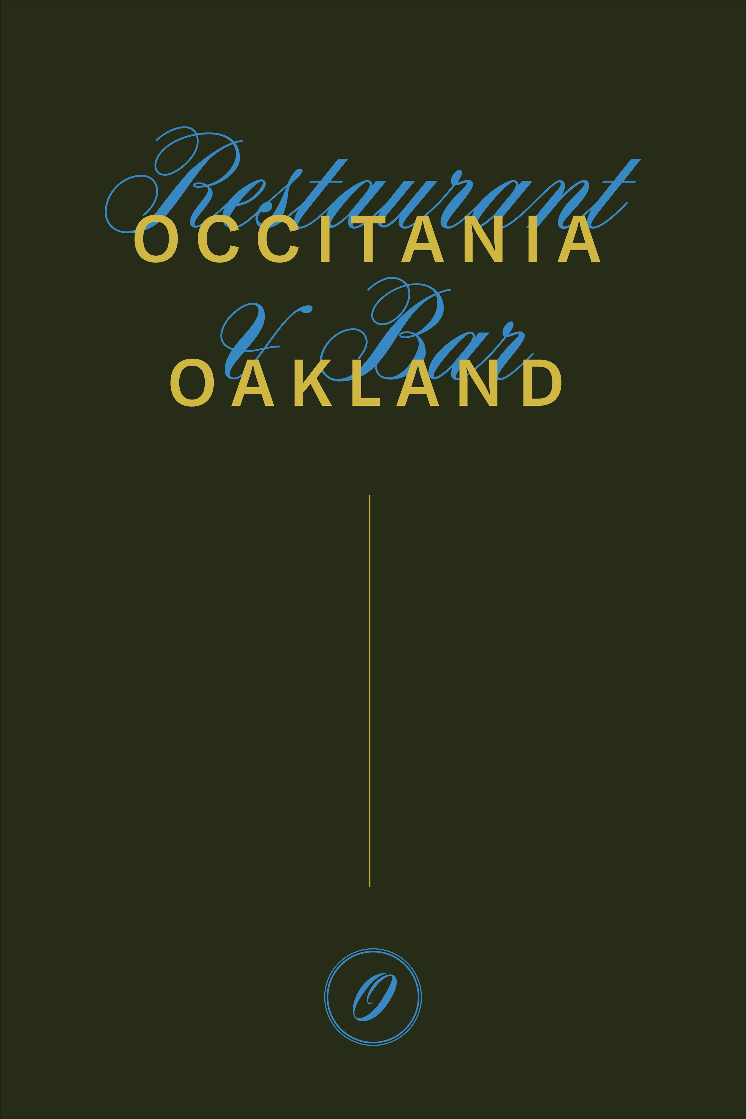
Occitania
Regional French Cuisine
Oakland, CA
SERVICES
Visual Identity Development
Collateral Design & Development
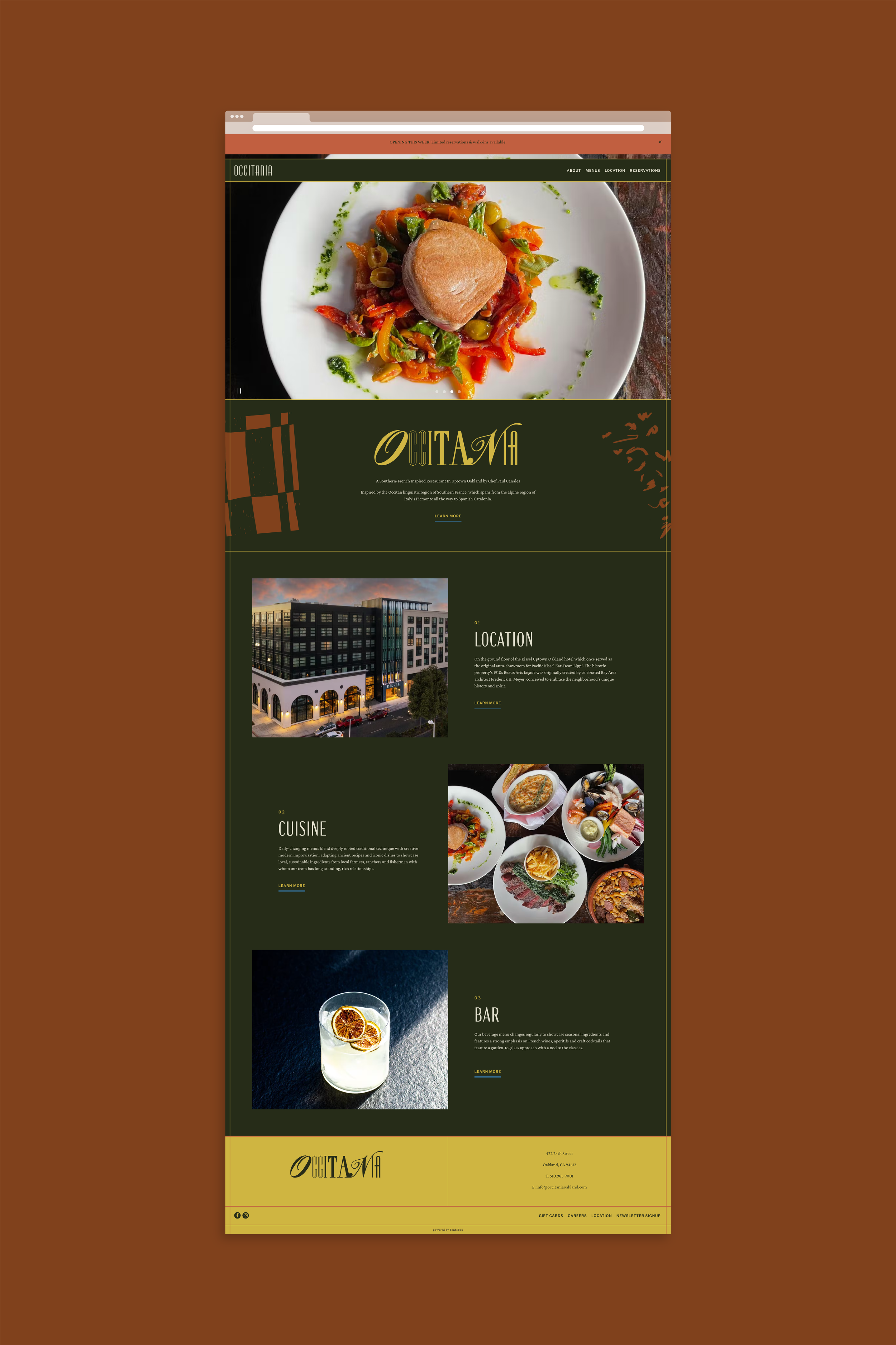
Website Design
Digital Graphics
Newsletter Design
Art Direction
Public Relations
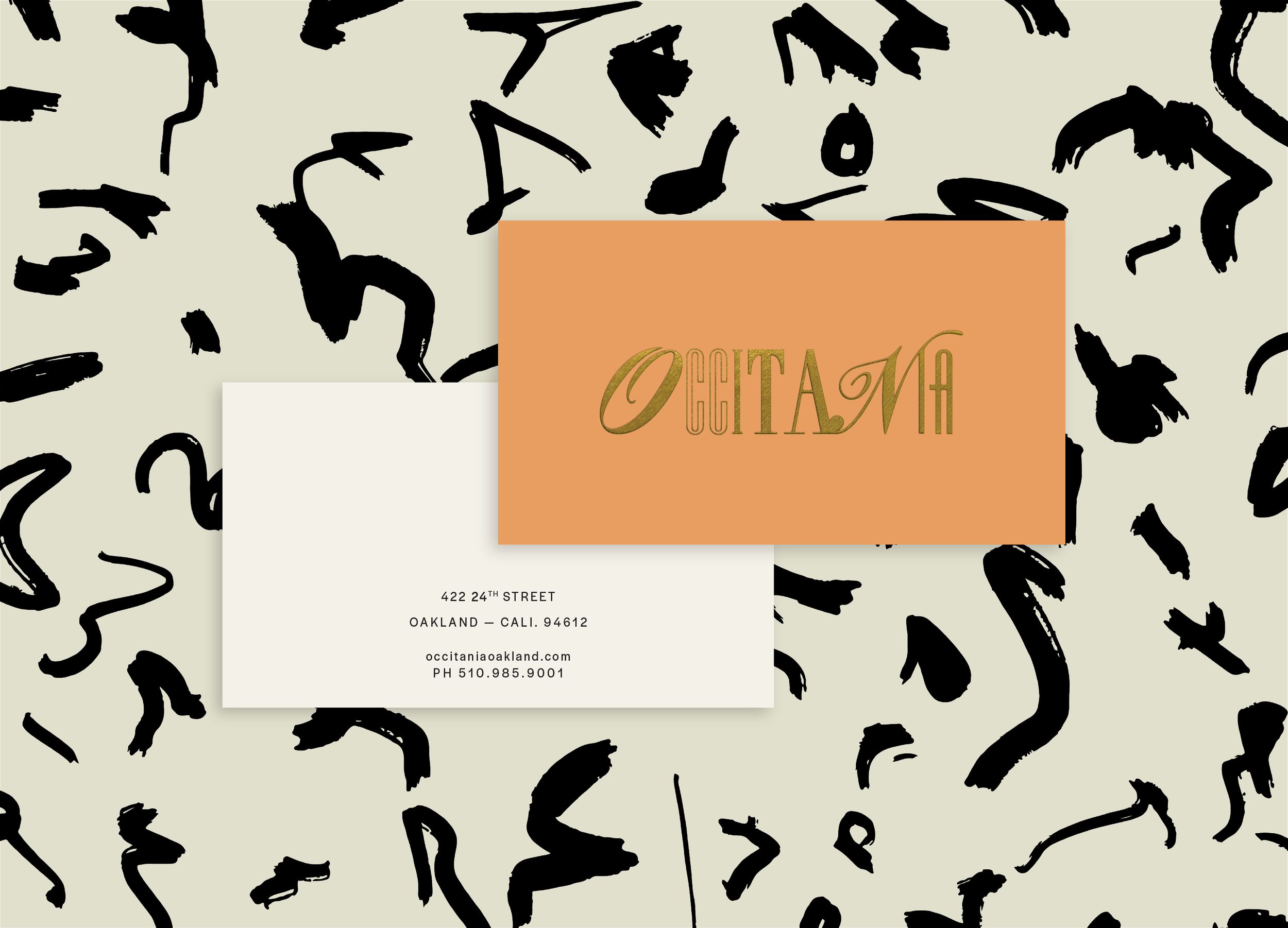
Logo Artwork: Sam Strand
The Brief
Inspired by regional southern French cuisine, Occitania (named after the traditional Occitan linguistic region) was conceived by Chef Paul Canales, who first made his mark on the Bay Area at Oliveto before becoming known for Spanish restaurant, Duende. Located in the design-forward boutique hotel, Kissel, in Oakland, CA, the restaurant honors the interplay between traditional and contemporary, and features a daily changing menu. The Occitania team reached out to us to help bring their vision to life, supporting both the development of the brand and its launch. Our team set out to craft a visual identity that would embrace and convey Chef Canales' highly-unique vision and approach based around ideas of polar opposites such as light vs. shadow, rusticity vs. refinement and spontaneity vs. methodology. In addition to the visual identity development, our team provided collateral design & development, website design, digital design and art direction for photoshoots. We also provided a comprehensive public relations launch strategy.
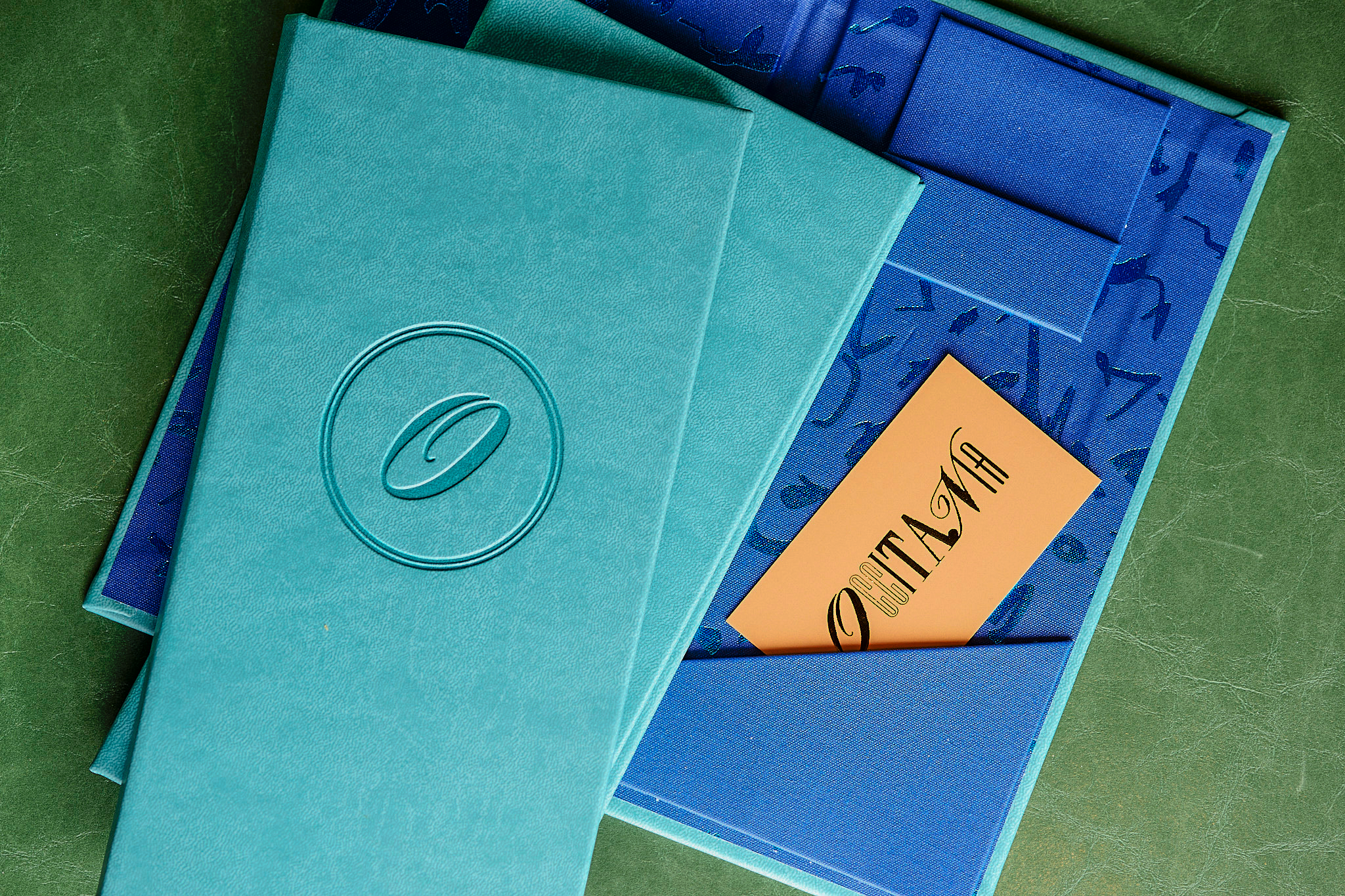

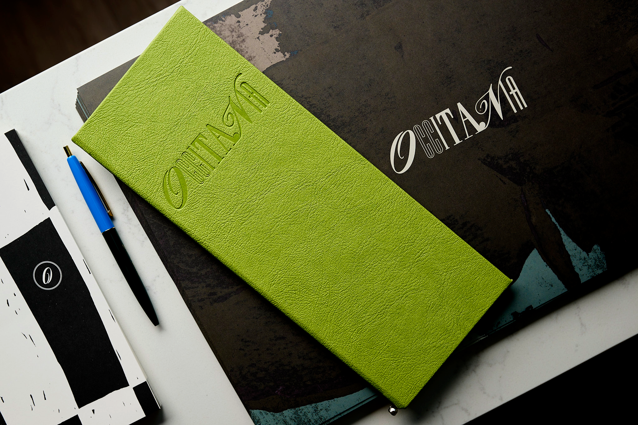
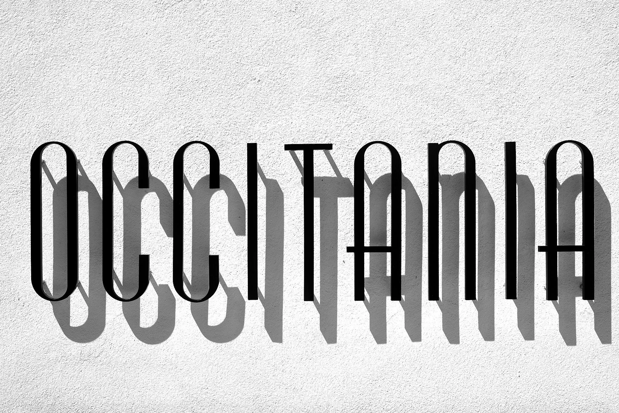
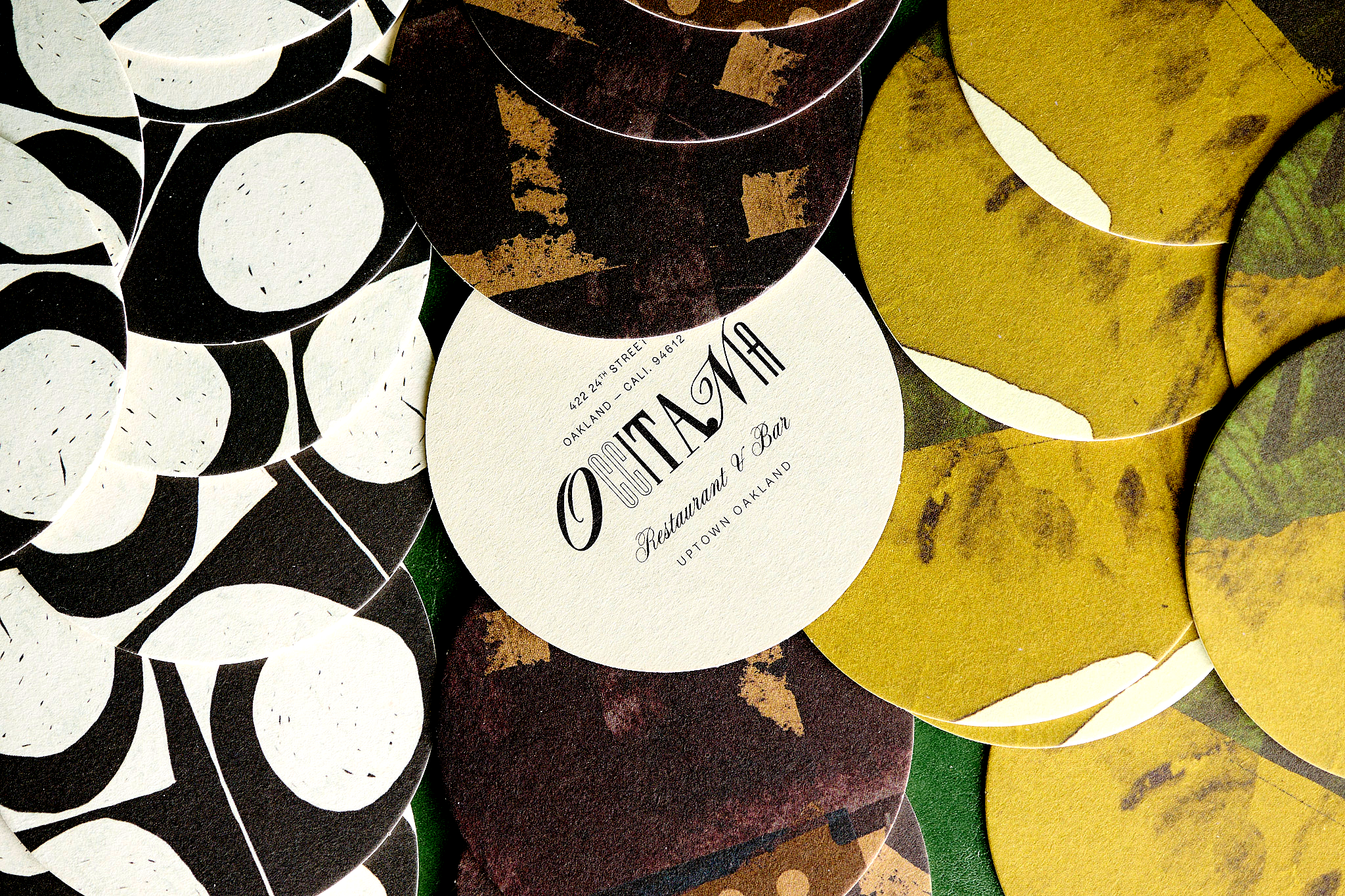
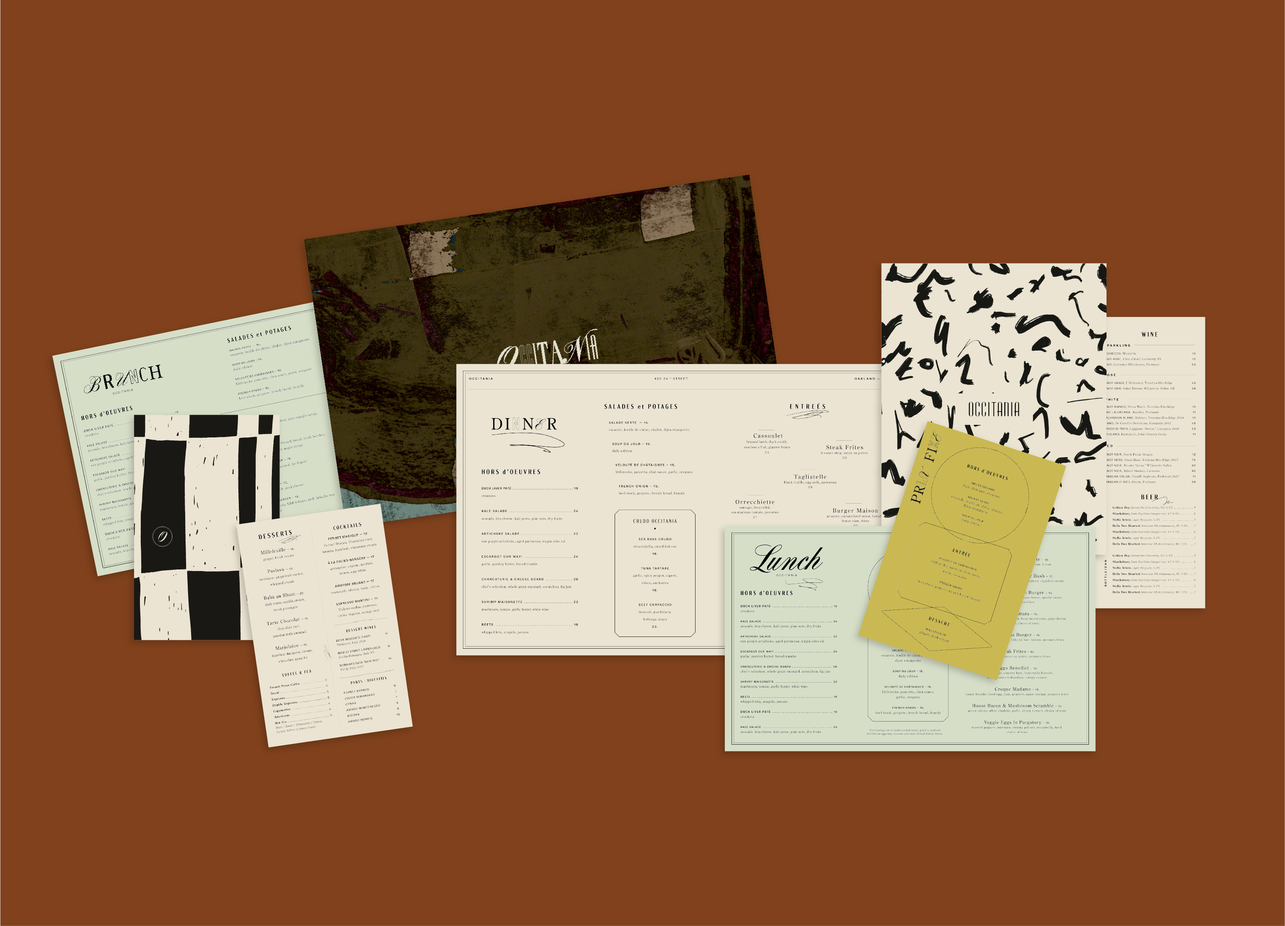
Visual Identity
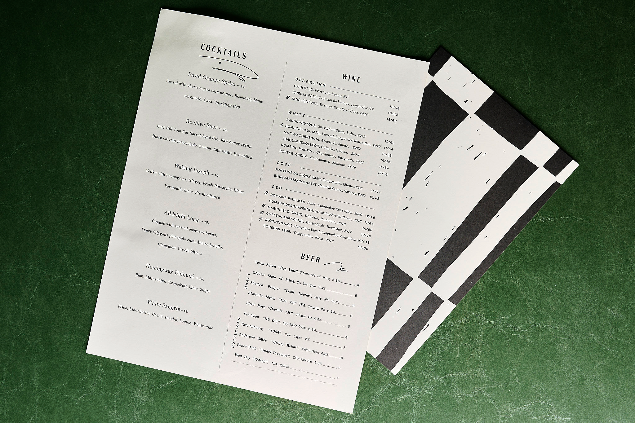
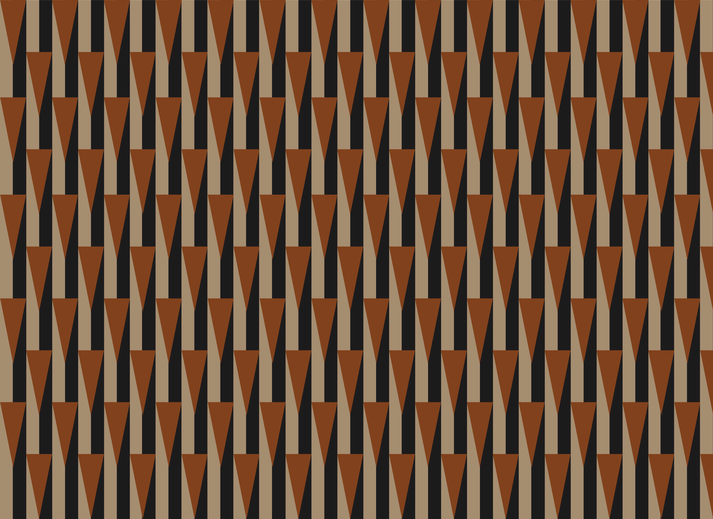
The restaurant space featured various artwork and installations from Bay Area-based artisans. Working from initial logo artwork by artist Sam Strand, our team developed a visual identity and supporting logo system inspired by the balance of duality. With correlations to Art Deco, Mid-Century Modern and Classical art, the extensive color palette is both bold and vibrant yet rich and earthy. Unexpected color combinations such as electric blue, apricot, mustard yellow, beige and emerald green connect subtly to materials used throughout the interior. A variety of custom patterns ranged from abstract brushstrokes, collaged paper and hand drawn motifs were used across menus, coasters, bespoke metallic foil check presenters in addition to digital applications like the website and social media graphics. The menu design draws inspiration from literature and sheet music with item descriptions that cascade down the page like the cadence of written poetry. The resulting identity and various touch points work in harmony to communicate than extraordinarily unique concept, conceived to awaken and enchant the senses.

Public Relations Launch
The public relations strategy utilized Chef Canales’ reputation to build anticipation for the concept as well as introduce his stellar team, generating anticipatory coverage six months out, and securing placements in the top three local media outlets for “Most Anticipated Restaurants.” Two pop-up previews allowed us to deepen media relations and generate appeal in the broader community, ultimately resulting in feature stories in Eater SF and The San Francisco Chronicle, as well as other major local publications and national trade coverage.