The Springs Resort
An Evolution of a Wellness Sanctuary
Pagosa Springs, CO
SERVICES
Brand DNA & Verbal ID
Visual ID Refresh
Restaurant Naming
Restaurant Brand Development
Menu Design
Collateral Design
The Brief
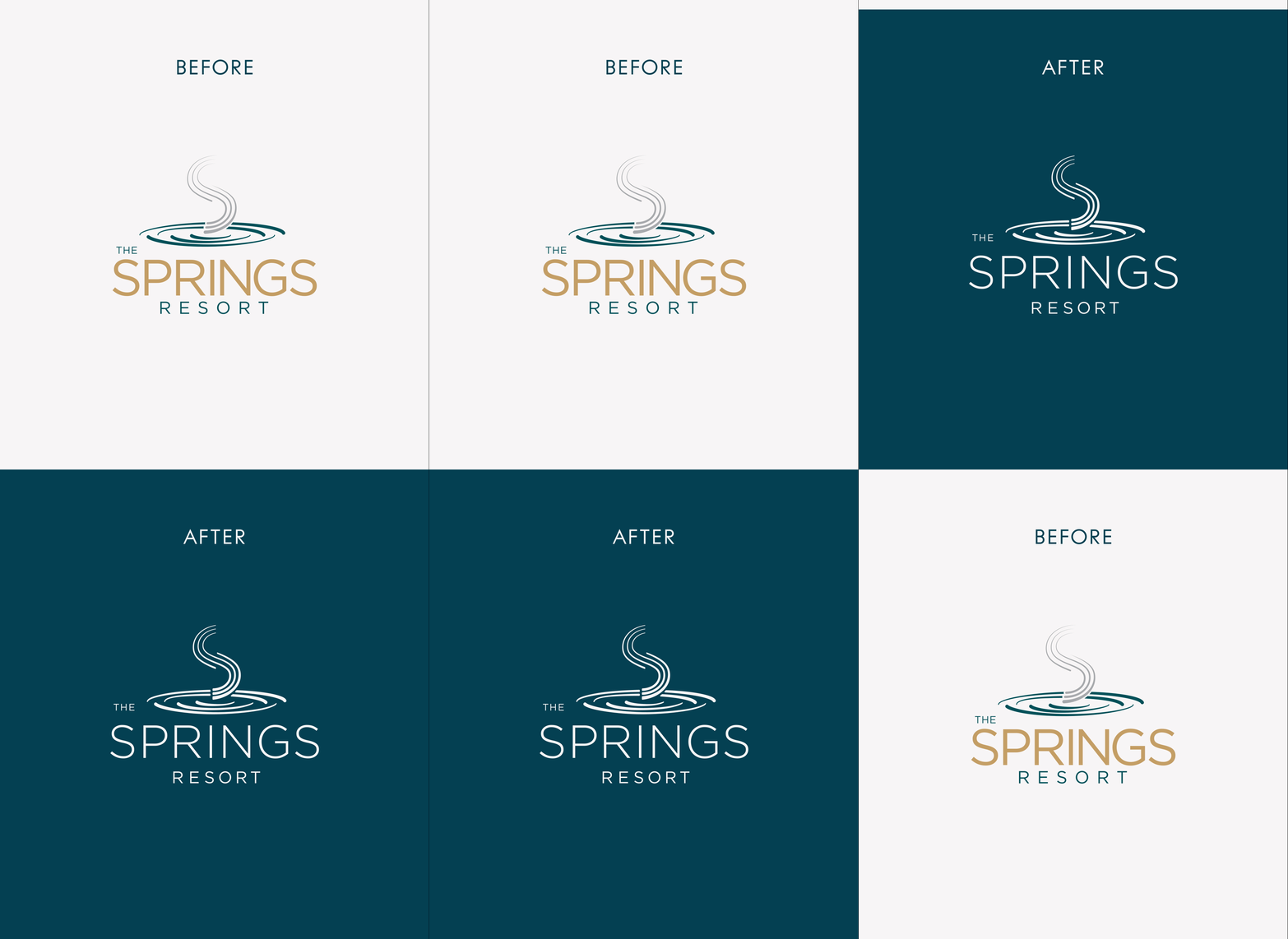
With a major expansion underway, The Springs Resort had a timely opportunity to refine its brand story—bringing its legendary hot springs and immersive wellness experiences into sharper focus for evolving audiences. Utilizing insights from a recent consumer study, Carbonate partnered with the resort team to refresh the brand DNA and verbal identity, anchoring the messaging in the pillars Explore, Restore, Connect, and the promise to “connect with nature’s restorative power.” From there, the visual identity was refined to create a cohesive and compelling narrative that resonates with both current and prospective guests.
A central part of the expansion was the addition of Wild Finch, the resort’s first full-service dining destination. With limited dining options nearby, the restaurant was designed to appeal not only to resort guests, but also to the local community. Its identity needed to reflect the elevated menu—rooted in seasonal, locally sourced ingredients—while embodying the spirit of Pagosa Springs, and connecting seamlessly with the resort’s overarching wellness ethos.

The Springs Resort
The combined brand expression positions The Springs Resort not just as an expanded property, but as a true sanctuary for wellness, dining, and memorable experiences—one that resonates deeply with both returning guests and new audiences.

Wild Finch
Named after the American goldfinch—a lively native songbird known for its social nature and bright yellow color, which ties into the sulfur found in the hot springs—Wild Finch embodies a vibrant yet natural energy. The visual identity draws from the local landscape, supported by typography and motifs that symbolize harmony and connection, while balancing refinement with approachability. Across signage, collateral, and digital touchpoints, these elements unify the restaurant and resort under a shared philosophy of a rejuvenating and restorative experience, deeply rooted in place.